ROUND-UP June 21-24, 2018

Hello readers! This post has links to art reviews from Artblog and the Humble Arts Foundation, and a movie review for a local Philly site called Moviejawn--a new byline for me!
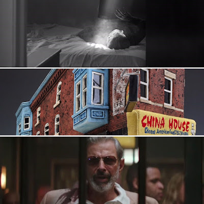
"The exhibition consists of twelve untitled photographs, four to a wall, in an alcove gallery space on the second floor. Predominantly images of people, they all seem to deliberately capture the split-second moment where nothing looks particularly real as if the subject and photographer have come together on an inhalation. One immediate standout is a photograph of a ball caught mid-bounce on a sandy ground, its shadow perfectly circular and separated enough to feel almost disconnected entirely. Dark and light passages mingle over the planes of bodies in motion or in repose, glancing off or diving into textured surfaces, half-concealed by shade or in direct view of the lens. While the images are each individual discrete compositions, presenting twelve of them together lets them volley in matching rhythms of form and shape."
"While the world hasn’t ended in ice a la Snowpiercer, the increasing privatization of natural resources, rampant police brutality, and the concept of concierge doctors who only cater to the uber-wealthy are all things that exist in 2018. Setting Hotel Artemis in Los Angeles in 2028, therefore, feels entirely probable and allows the narrative’s themes of inequality and the extralegal privileges granted to the obscenely wealthy to feel like both recording of fact and cautionary tale. After all, the cops are on the ground in downtown Los Angeles, beating and abusing protesters who simply want the water turned back on, ignoring the presence of a literal hospital for assassins and other criminals a few stories up."
"An immediate highlight of the show is Carly Slade’s eye-catching 2046 W Diamond Street, which occupies the center of one of the show’s two dedicated gallery spaces. Using ceramics and mixed media, Slade has constructed a miniature street corner in Philadelphia: an apartment complex with a Chinese restaurant on the street level, all rendered with illusionistic, precise detail. But what makes the work truly dynamic is Slade’s use of forced perspective. As you circle the work, it becomes apparent that Slade has compressed the building on one end and tilted the top of the base at an angle, creating an unsteady feeling that is only exacerbated by the way the plinth (made of what appears to be reclaimed wood) is tilted in precisely the opposite direction. It’s as if the building is mid-backslide and attempting to hold on for dear life."

Comments