ART REVIEW: Claire A. Warden and Arielle Bobb-Willis: Two Photographers' Strikingly Different Approaches to Turmoil
The Philadelphia Photo Arts Center’s annual Contemporary Photography Exhibition has been one of my most anticipated arts events all year. I previously wrote about last year’s two-person show (or, rather, two small shows in the same gallery) and this year’s exhibitions were no less captivating. While Claire A. Warden’s Mimesis and Arielle Bobb-Willis’ At Zephyr do not play off one another as easily as Christine Elfman’s Even Amaranth and Mark Jayson Quines’ NOBODY, they are each impactful, thoughtful bodies of work that prove that there is no shortage of talent available to the PPAC.
 |
| No51 Concrete © Claire A Warden |
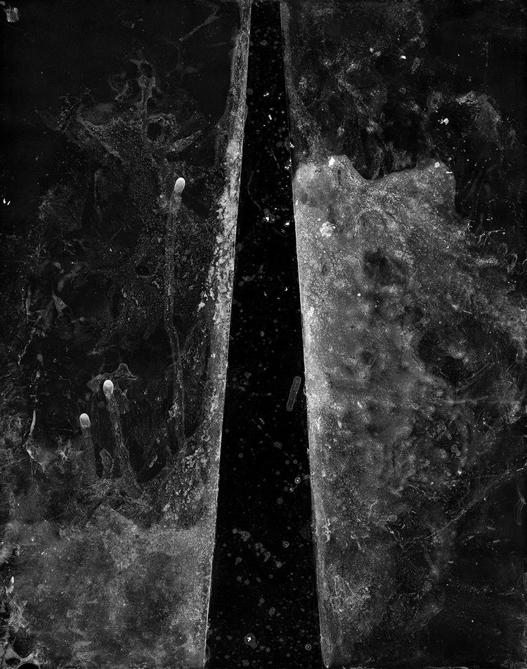
Mimesis is very cannily and subtly about identity, rooted in her experiences growing up in a mixed-race family. For Warden, the lack of obvious subject matter reflects the unfortunately common urge to ask people who don’t fit neatly in delineated ethnic categories “what are you” to try and pin them down, to categorize and classify them, as if understanding naturally follows knowing someone’s racial makeup. In that sense, that the works resemble microscope slides is delightfully ironic, because biology and science are often not the most sophisticated ways to understand someone’s identity. Warden subverts that urge towards biological essentialism by presenting science-inflected images as inscrutable and often frustratingly abstract. Just as asking someone “what” they “are” isn’t going to reveal their truth, knowing someone’s gene expression isn’t the whole story of who they are.
Warden’s most stunning works resemble Sally Mann’s velvety, textured black-and-white photographs of Civil War battlefields; in particular, No. 09 (Not Basic Color Theory), (seen paired with Bobb-Willis’s image up top) which has a simple enough composition of a triangle etched into that dark, patchy film surface, is downright enthralling. Each tiny mark feels like a crackling spark; paler smudges towards the left side of the composition resemble smoke. I could have stared at it for hours, and felt myself leaning forward as if to press my nose against the glass separating it from me. No. 43 (Expectational) is aptly titled and marvelously inventive, playing with conceptions of color theory and turning our usual expectation of pictorial depth on its head.
 |
| No43 - Expectational © Claire A. Warden |
We might assume that a black yonic shape (think Georgia O’Keeffe) presented against a white ground might well be a slit cut into that paler ground, creating a void. But as you consider the work again, it becomes clear that Warden has given it slightly blurred edges, making the negative space appear to cast a shadow--and thus, not negative space at all; not a void or a hole or a lack, but positive space, the subject of the piece.
Warden also includes several of the original pieces of film, incorporated into small booklets placed in the center of the gallery space that include information about the meanings referenced by the works’ titles, or short anecdotes that discuss the context of the work’s creation. For example, No. 57 (Gradient) features small, rough rectangles of increasingly pale values arranged against a darker, wonderfully textured backdrop. Subsequently, the booklet about No. 57 (Gradient) explains the composition of the larger work by discussing the implicit (and often explicit) racism in standard 1950s Kodak film. The so-called “Shirley card” was used by Kodak to calibrate accuracy for white skin tones, meaning that darker skin tones (and darker colors in general) were often shot poorly and inaccurately. It was only when manufacturers complained about Kodak film not being able to represent their furniture and chocolate products correctly (and flatteringly) that the system of color calibration began to change, rather than any concern about whether people were being photographed correctly.
 |
| No57 - Gradient © Claire A. Warden |
 |
| No. 42 (Emphasis) - © Claire A. Warden |
 |
| No. 15 (Genetics) © Claire A. Warden |
No. 15 (Genetics) may not be the most eye-catching of the bunch, but it’s quite possibly the key to interpreting Warden’s intentions with Mimesis. The composition magnifies a thumbprint, and surrounds them with small x’s and o’s and strong lines that undoubtedly have some kind of scientific meaning. In practical terms, though, these additions resemble football diagrams, as in the representations of coordinated plays that team members must study and learn in order to know how to act. The takeaway here is that for Warden, the construction of identity is active, not passive – something to be actualized, rather than a label you accept from someone else. Football players can’t just run around the field wherever they want and expect success; they must be intentional, and in Mimesis, Warden is nothing if not intentional in the presentation and exploration of her identity, assuming nothing, taking nothing for granted, defining herself on her own terms and hers alone.
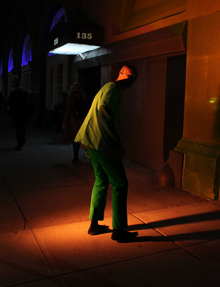
Even without reading her statement, though, we can tell that the photographs in At Zephyr are not purely joyful; her subjects, clad in all manner of pinks, yellows, greens, oranges, and other bright colors, reflect discomfort in their awkward poses just as the hues they wear are meant to connote positive emotions. Indeed, it feels like a visual manifestation of what writer Jenny Lawson calls “furiously happy” – the philosophy of acknowledging your hurt and pain and being as happy as you can be in spite of it, and because of it, and being purposefully and angrily exuberant in the face of struggle.
The works here are a mix of sizes, ranging from 30 by 24 inches all the way down to 7 by 5-inches, all laid beside one another, pushing you to step closer and further away to take in each image. Already, you’re a little off balance, and that’s before you see the compositions themselves. All but one are vertically-oriented in portrait mode, depicting people in strange, dancelike poses wearing clothes that mix eighties and avant-garde fashions, all with their faces obscured to some degree.
 |
| New Jersey 01, 2017 © Arielle Bobb-Willis |
The colors and styles clash; New Jersey 01, 2017 stages its protagonist in electric green and light blue, holding a bright red bag with cut-out holes, their face covered in stripes of rainbow popsicle sticks. New Orleans 07, 2018 hides the figure’s face with the straps cut out in their neon pink sweatshirt, carefully placing one across the eyes and another across the mouth in a cheerfully hostile way, almost resembling bars to keep us out. South Street Seaport, 2016 stuffs the figure’s open mouth with what could be a fruit rind, the eyes covered by their light aqua hood, the implied sound being silenced, communication being cut off.
 |
| South Street Seaport, 2016 © Arielle Bobb-Willis |
 |
| NYC 01, 2019 © Arielle Bobb-Willis |
The images in At Zephyr that don’t depict Bobb-Willis’ human subjects are less of a natural fit in terms of subject matter, but contribute to the overall emotional landscape of the body of work. Sprinkled throughout the dancer-like poses and neon sweatshirts are candid-looking shots of scenery, of buildings on street corners, of the sky at sunset, giving credence to the idea of surrounding oneself with positivity to combat negative feelings.
 |
| New Orleans 07 © Arielle Bobb-Willis |
New Orleans 03, 2015 (paired with Warden’s photo at the beginning of this review) is a small-scale image, simpler in its composition than the contorted poses on adjacent walls, but manages to capture the warring urges of isolation and connection that bubble to the surface during depressive episodes. Nothing says “go away, leave me alone; please don’t abandon me” like a person showing the back of their head through the neck hole of their sweater. “I exist, but I can’t look at you right now; but I need you to know I’m here still, and I’m glad you’re still here with me.”
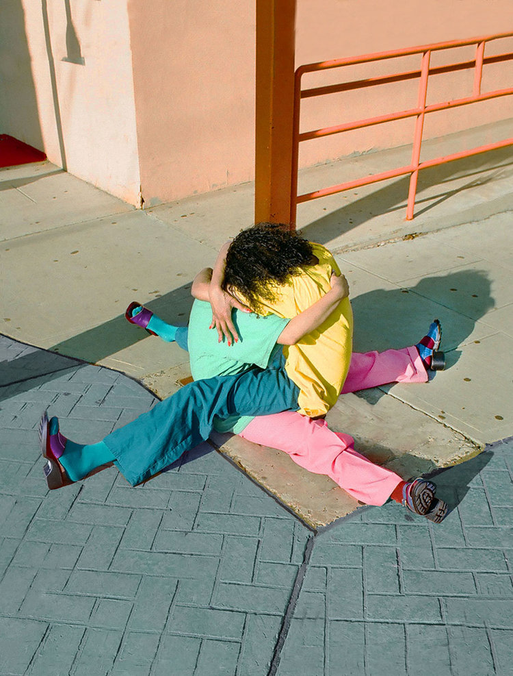
That same desperation of emotion is captured more plainly in New Jersey 02, 2017, where two figures hug one another in a seated position, their legs and arms and bodies entwined, the palette cleverly dividing itself between cool blues on the left (created by the left figure’s shirt and the right figure’s pants) and warm pink and yellow on the right (created by the right figure’s shirt and the left figure’s pants). Without one another, they’re muddled, but supporting one another and embracing in this way, the colors ring out harmoniously.
 |
| New Jersey 02 © Arielle Bobb-Willis |
Whether Bobb-Willis’ subjects’ faces are turned away from the camera, or are hidden behind hair or clothing or accessories or even shadows, the mood is consistent and clear: these photos are completely internalized. They’re not here for us, the viewer, and wouldn’t be here for the photographer but for the careful staging of the image to keep their faces private. They might be depressed, anxious, filled to the brim with dread and misery, but they’re going to do what they need to, and “fuck you” if you have a problem with it. New Orleans 04, 2016 furthers the antagonistic relationship between viewer and subject through body language in a more physically graceful but no less potent way: clad in a white bodysuit with painted hands, the subject stands partially slumped over, arms hanging limply like a marionette, challenging us either to pull them upright--to engage--or to simply go away, and leave them alone already.
While Mimesis and At Zephyr might not share much in common on a formal level, stepping back from the two simultaneous shows reveals startling emotional overlaps. Both artists’ works are intrinsically linked to physicality and human actions as a way of understanding or expressing something new about oneself. Warden applies saliva and scratch marks to film, creating a brimming tension that indicates the frustration she’s faced in the construction and acceptance of her identity (think of the makeup artist associating dark under-eye circles with Indian heritage). Meanwhile, Bobb-Willis stages her subjects in contorted, often painful-seeming dancelike poses, as if they are avatars for the emotions and turmoil simmering within her, and cloaks the entire composition in bright colors that repel as much as they attract.


Comments
Post a Comment